
The Bridge Community Hub Brand Launch and Website
The Bridge
Two years in planning, The Bridge needed to capture its spirit of collaboration and connection. The organization needed a visual identity, collateral, and a public-facing website that reflected its many services.
Build a complete brand from scratch and launch a website ready to serve neighbors, funders, and partners on day one.
A Great Idea delivered logo, brand system, collateral suite, and a live website with program listings, events calendar, and partner section. The organization has grown its partner network and expanded programming since launch.
AWARD RECOGNITIONS
Identity Designed to Connect
The Bridge NC had no visual language to start from — so we built one from the ground up with a single goal: create a mark that earns trust on both sides of the room. The logo and brand system needed to feel warm and neighborhood-rooted for community members approaching services for the first time, and professional enough for funders and institutional partners making investment decisions. We chose typography, color, and form that project stability and openness simultaneously — avoiding both the sterile look of institutional nonprofits and the informal feel of community flyers. The result is a cohesive identity that carries the organization's name with credibility across every format it touches.
Collateral Built for Real-World Use
With a brand in place, we designed print and digital materials built around how The Bridge actually operates — a small team, multiple audiences, fast-moving programs. Every piece in the collateral suite draws from the same visual system while shifting tone and emphasis for its audience: community-facing materials lead with clarity and access; partner-facing materials lead with mission and organizational structure. Accessibility was a core requirement, not a checkbox — legible type, sufficient contrast, and plain-language copy ensure materials work for residents across literacy levels and visual abilities. The result is a suite that travels well, looks sharp, and communicates the right message to the right audience every time.
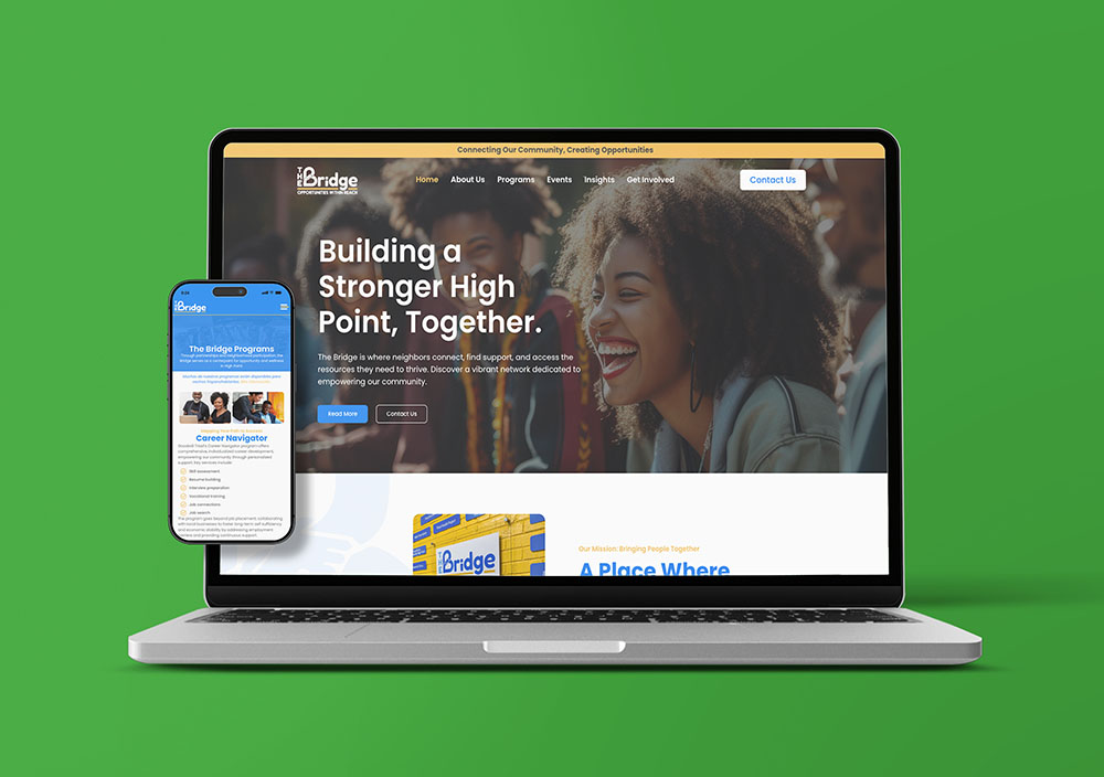
A Website That Does the Work
The Bridge's website is the organization's front door — for a neighbor looking for healthcare referrals, a funder evaluating the organization, and a potential partner deciding whether to plug in. We designed and built a site architecture organized around how people actually come to The Bridge, not around how the org is structured internally. Programs are findable. Events are current. Partners are featured. The Get Involved pathway is clear. Because the team is lean and the pace is fast, we built for maintainability — reusable structures and a straightforward content model that staff can manage without ongoing development support. As The Bridge has grown, the site has grown with it, adding partners and programs without needing a rebuild.
Why is brand identity important?
A strong brand identity makes you stand out from others, makes it easy for people to recognize you, and builds trust. It shows what you stand for, what you’re trying to do, and how you’re going about that in a way that connects with your community.
How long does a website project take?
This can vary! Simple sites using 2-3 templates with 10-15 pages can take just a few weeks, while large projects can take months. We tailor our timelines to fit your team’s needs, budget, and capacity while remaining transparent and accurate about how long the project will take.
What exactly is a landing page?
A landing page is a single, focused web page designed to drive a specific action—like donating, signing up, or registering—without the distractions of a full website.
What should I expect to pay for brand strategy consulting services?
The cost of brand strategy consulting varies depending on your specific needs, project complexity, and who you hire. Before any consultations, it’s important to define your goals and budget to ensure the scope of work matches your expectations. Small, independent consulting agencies like A Great Idea typically charge between $100 and $300+ per hour or $5,000 to $30,000 per full brand strategy project.
What are the key components of a brand identity?
- Logo: The visual representation of your brand
- Color Palette: The specific colors used to represent your brand
- Typography: The fonts and styles used in your brand communications
- Imagery & Graphics: The style of images and graphics that complement your brand
- Brand Voice and Messaging: The language and tone used in your communications
- Brand Guidelines: The document that codifies and ensures consistency across all brand collateral